TIMELINE
February - May 2023
ROLE
UX/UI Designer
TOOLS
Figma, Miro
DELIVERABLES
Web Design
OVERVIEW AND APPROACH
Curated Care: Simplifying Skincare with Expert Guidance 🫧
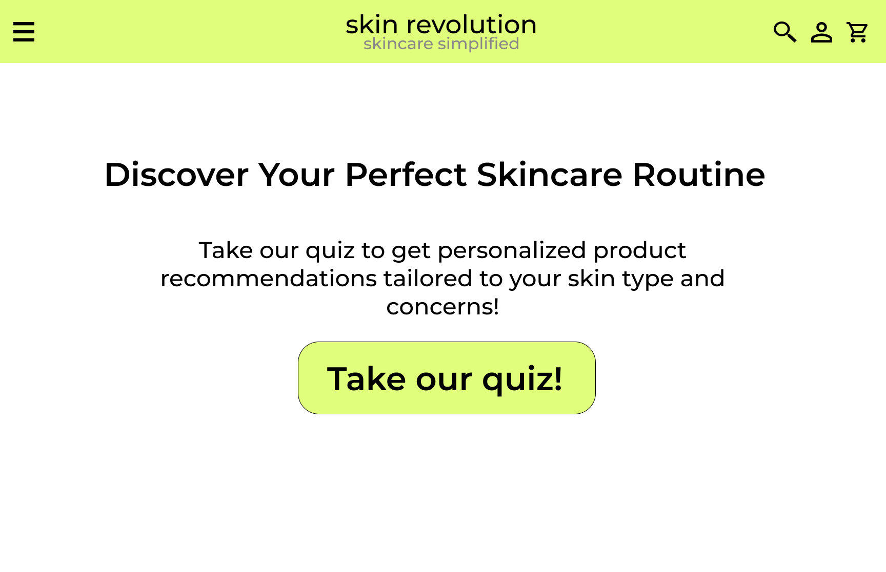
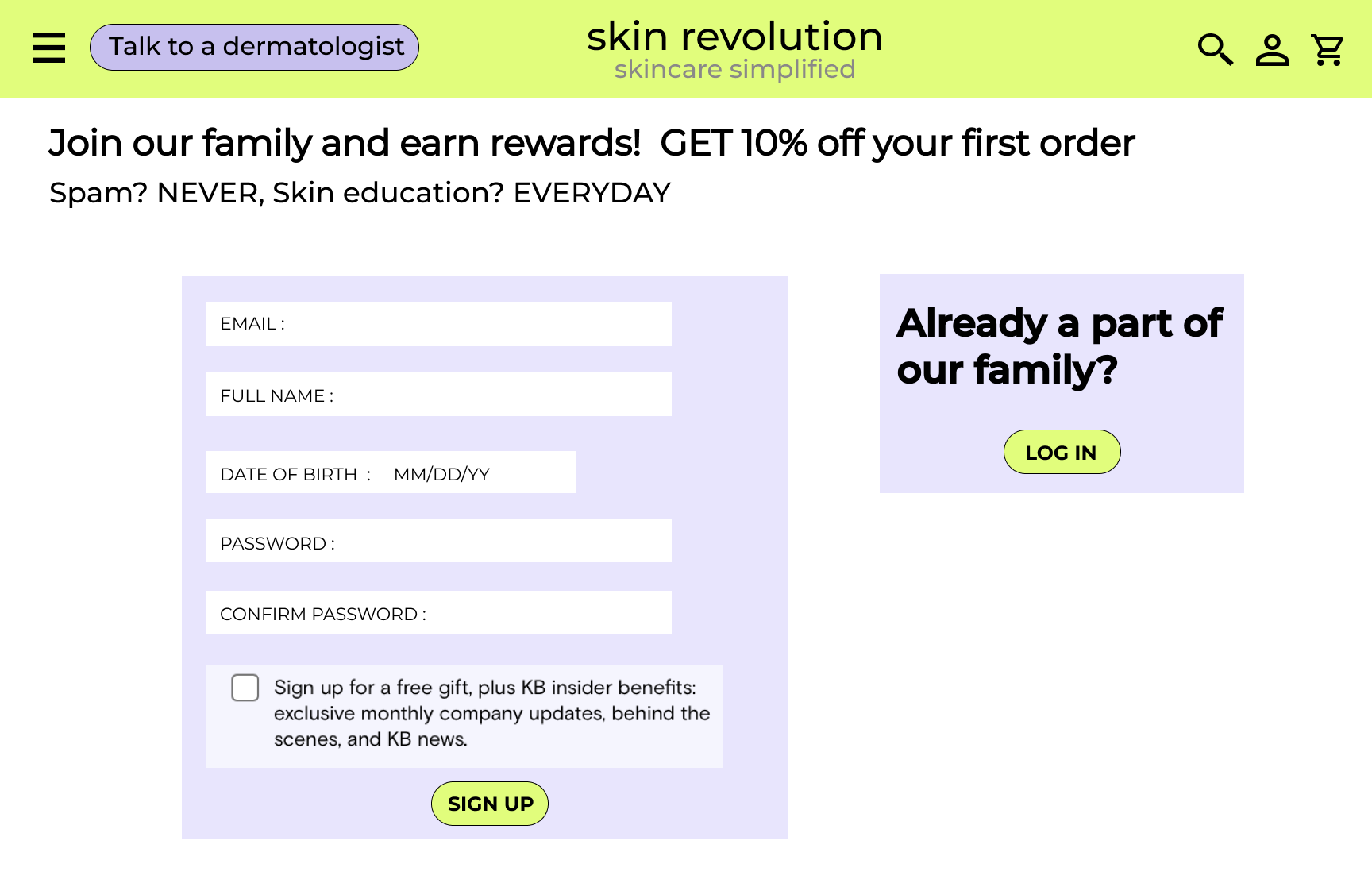
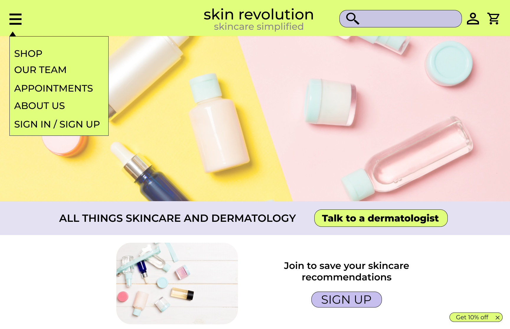
For this project, I developed a skincare e-commerce website that addresses the challenge of choosing from countless over-the-counter products. Through extensive research and analysis, I designed a user-centric interface that highlights only dermatologist-reviewed items. Key features like "Dermatologists' Favorites" and "Highly Recommended" ensure users can easily find effective products suited to their skin type and concerns. The goal for this project was to create a user-friendly skincare e-commerce platform that simplifies the process of selecting safe and effective products.
PROBLEM STATEMENT
With an overwhelming number of skincare products available in the market, consumers often struggle to make informed choices that suit their unique skin needs. The abundance of conflicting information and generic reviews online only adds to this confusion, leading to frustration and the potential for harmful skincare decisions. There is a pressing need for a reliable, user-friendly platform that simplifies the decision-making process by offering expert-reviewed, personalized product recommendations, ensuring users can confidently select the right products for their skin.
TARGET USERS AND DEMOGRAPHICS
I identified the target users as individuals aged 18-45, predominantly women, who are overwhelmed by the vast array of skincare products on the market. These users seek trustworthy recommendations to address specific skin concerns. They value expert advice and are often influenced by health and wellness trends. My research highlighted the need for a platform that simplifies product selection, builds trust, and offers tailored solutions, all within a user-friendly interface.
MARKET RESEARCH
To inform the design of this project, I conducted a market research analysis focusing on three industry leaders: Sephora, Ulta Beauty, and Curology. The analysis compared their business models, user interfaces, and customer engagement strategies. By examining how these brands cater to different demographics and skin care needs, I gained valuable insights into the strengths and gaps in the current market.
Sephora:
Business Model: Multi-brand retailer with a vast selection of products.
User Interface: Highly interactive with robust filtering options and personalized recommendations.
Key Feature: Beauty Insider program driving user engagement.
Important Statistics: Over 25 million Beauty Insider members globally.
Ulta Beauty:
Business Model: Wide product range across various price points; both drugstore and high-end brands.
User Interface: Intuitive with easy navigation and loyalty program integration.
Key Feature: Ultamate Rewards program, attracting diverse customers.
Important Statistics: 31.8 million loyalty program members in 2023.
Curology:
Business Model: Direct-to-consumer, personalized skincare solutions.
User Interface: Minimalist and user-friendly, focusing on tailored experiences.
Key Feature: Custom products based on individual skin assessments.
Important Statistics: Over 1.7 million active customers.
USER RESEARCH
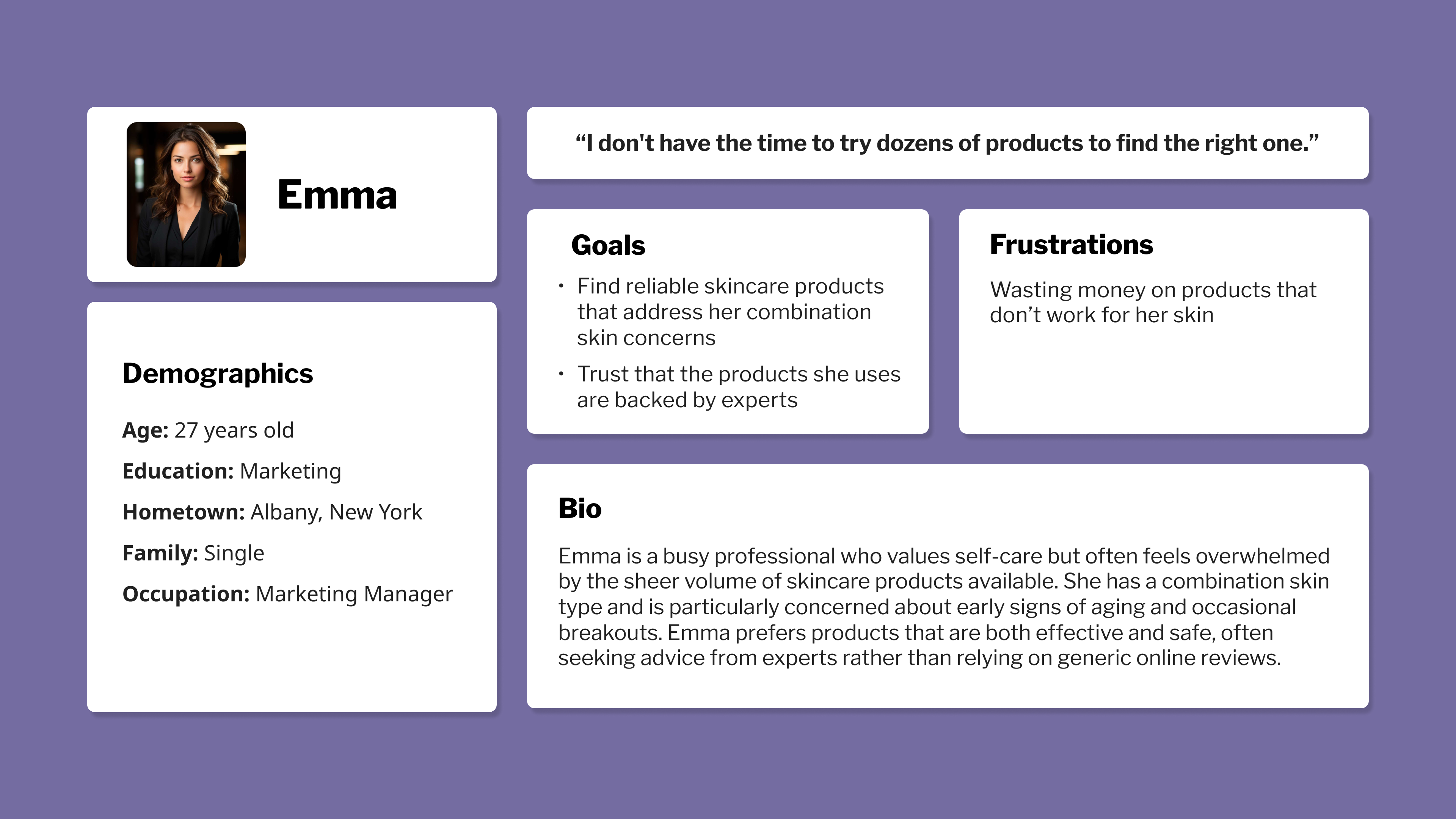
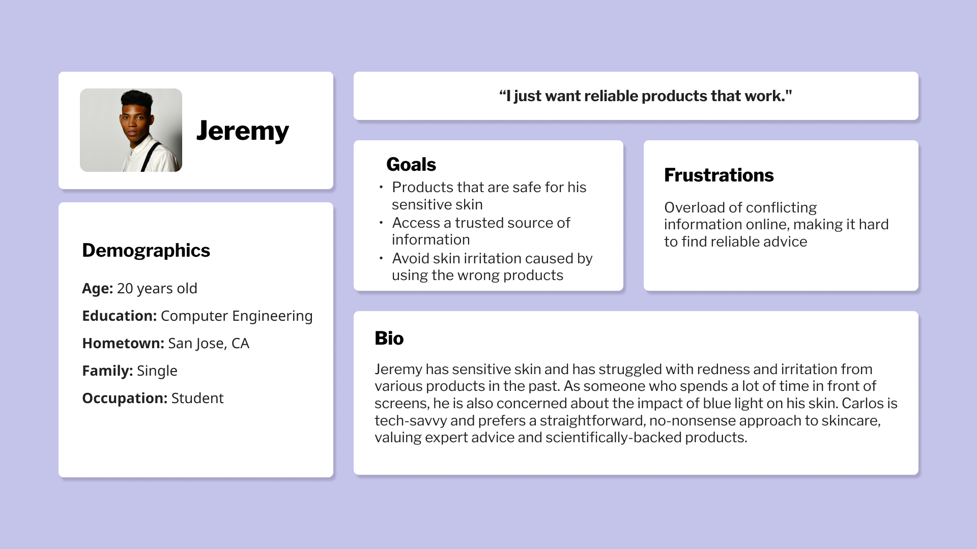
By understanding the behaviors, preferences, and pain points of potential users, I ensured that the final product truly addresses their needs. The research focused on identifying key motivations behind skincare purchases, the challenges users face in selecting the right products, and their expectations from a trusted e-commerce platform.
User Interviews
Conducted one-on-one interviews with a select group of users who frequently shop for skincare products online.

User Personas
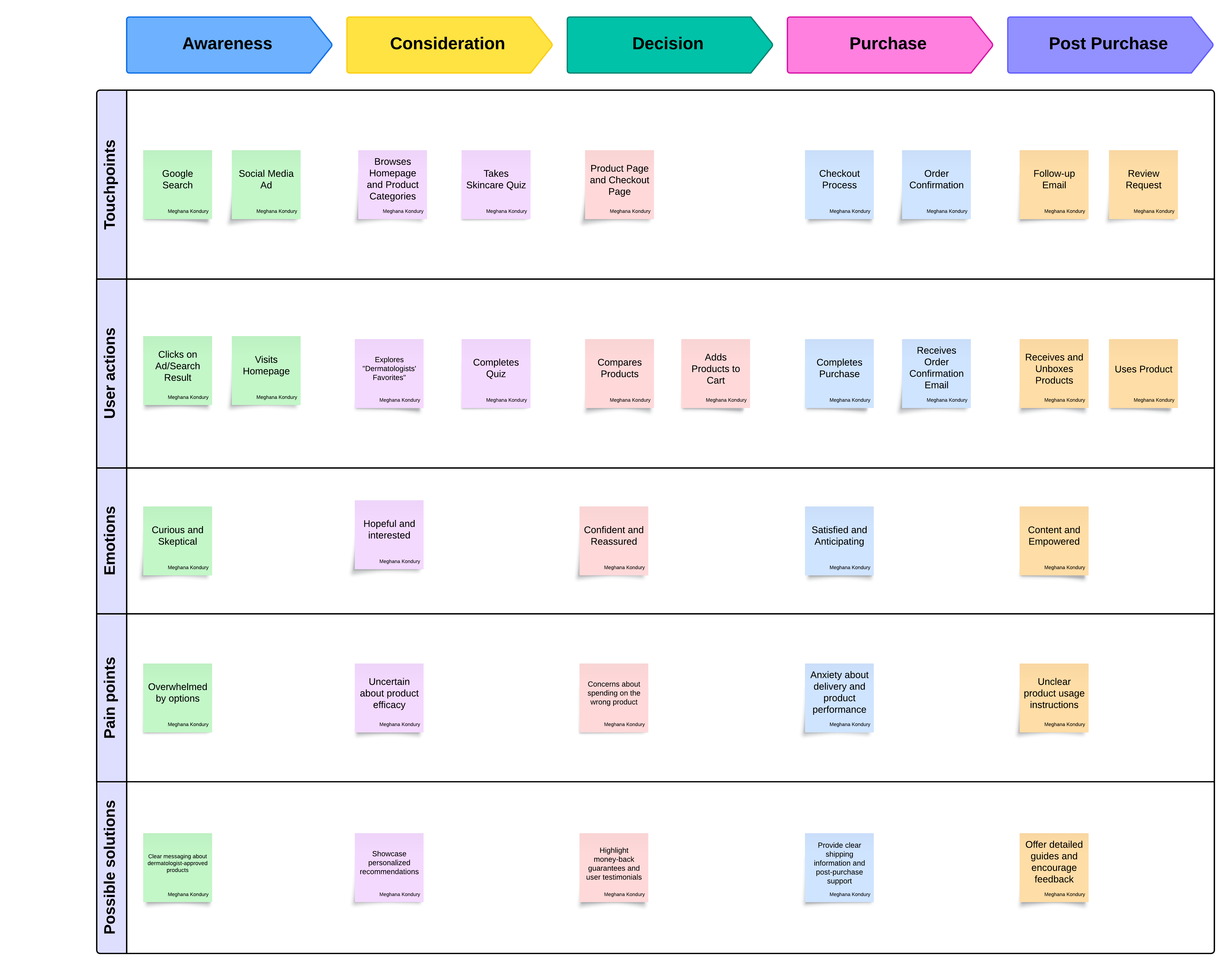
User Journey Mapping
DESIGN
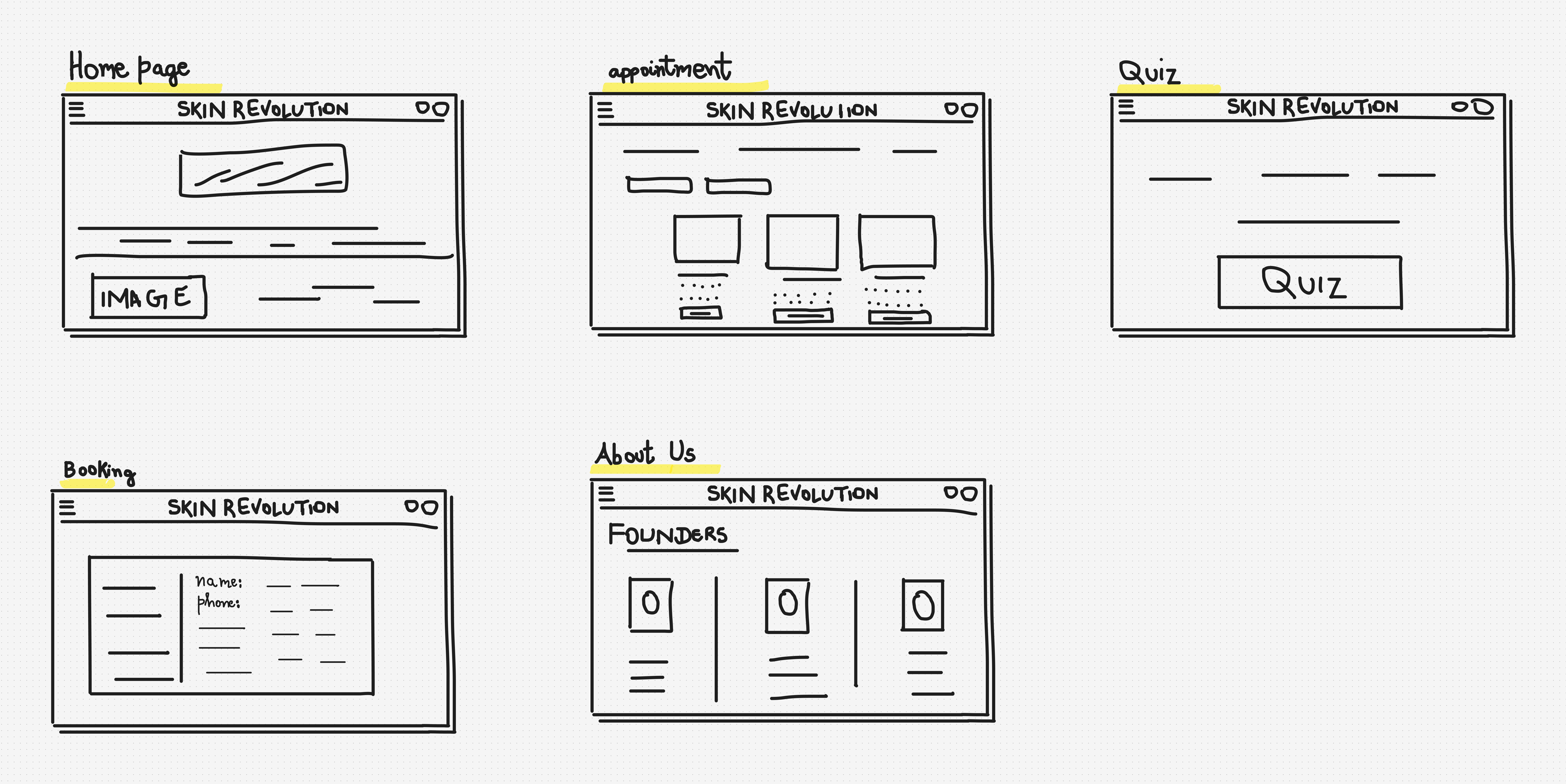
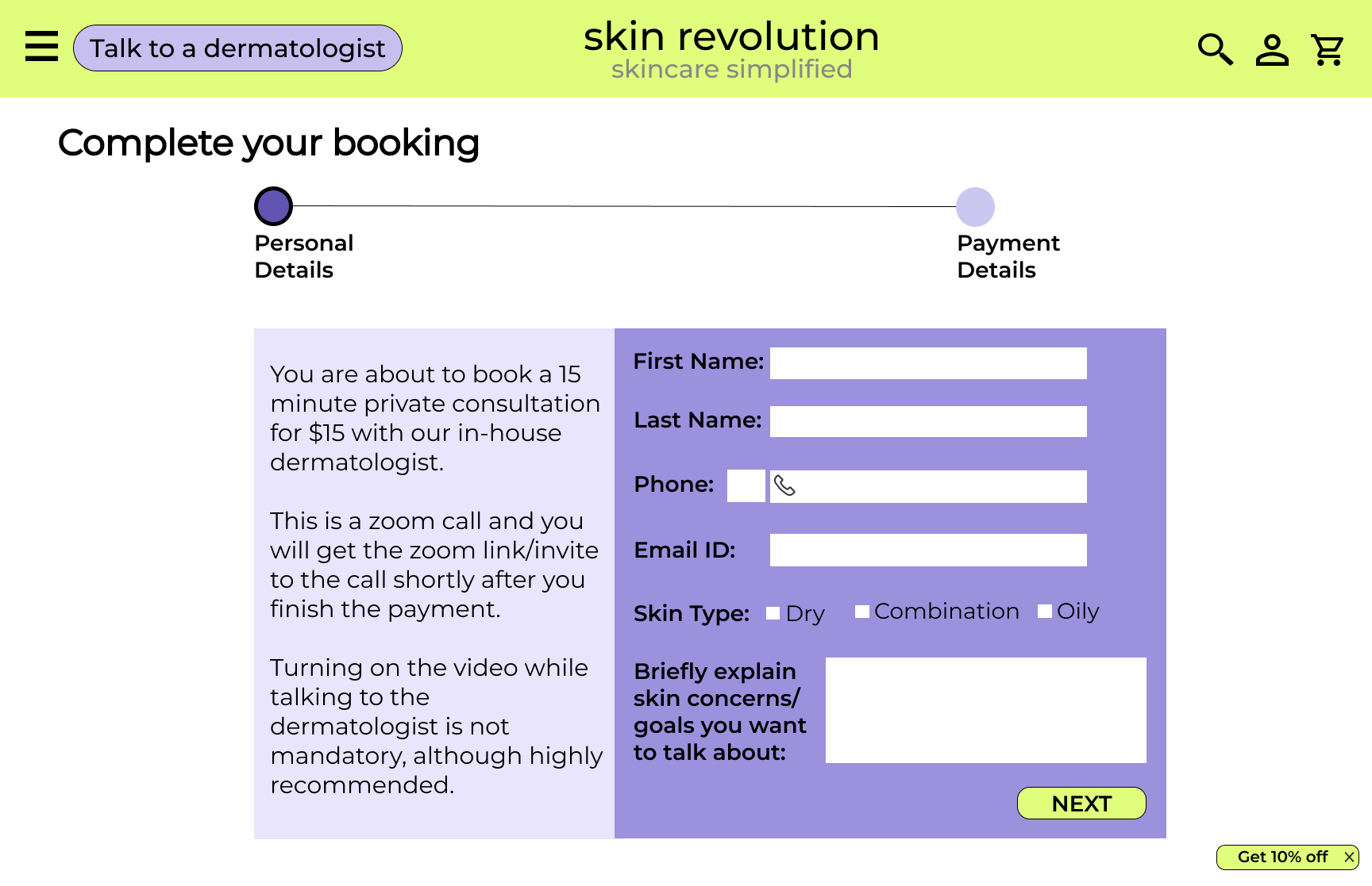
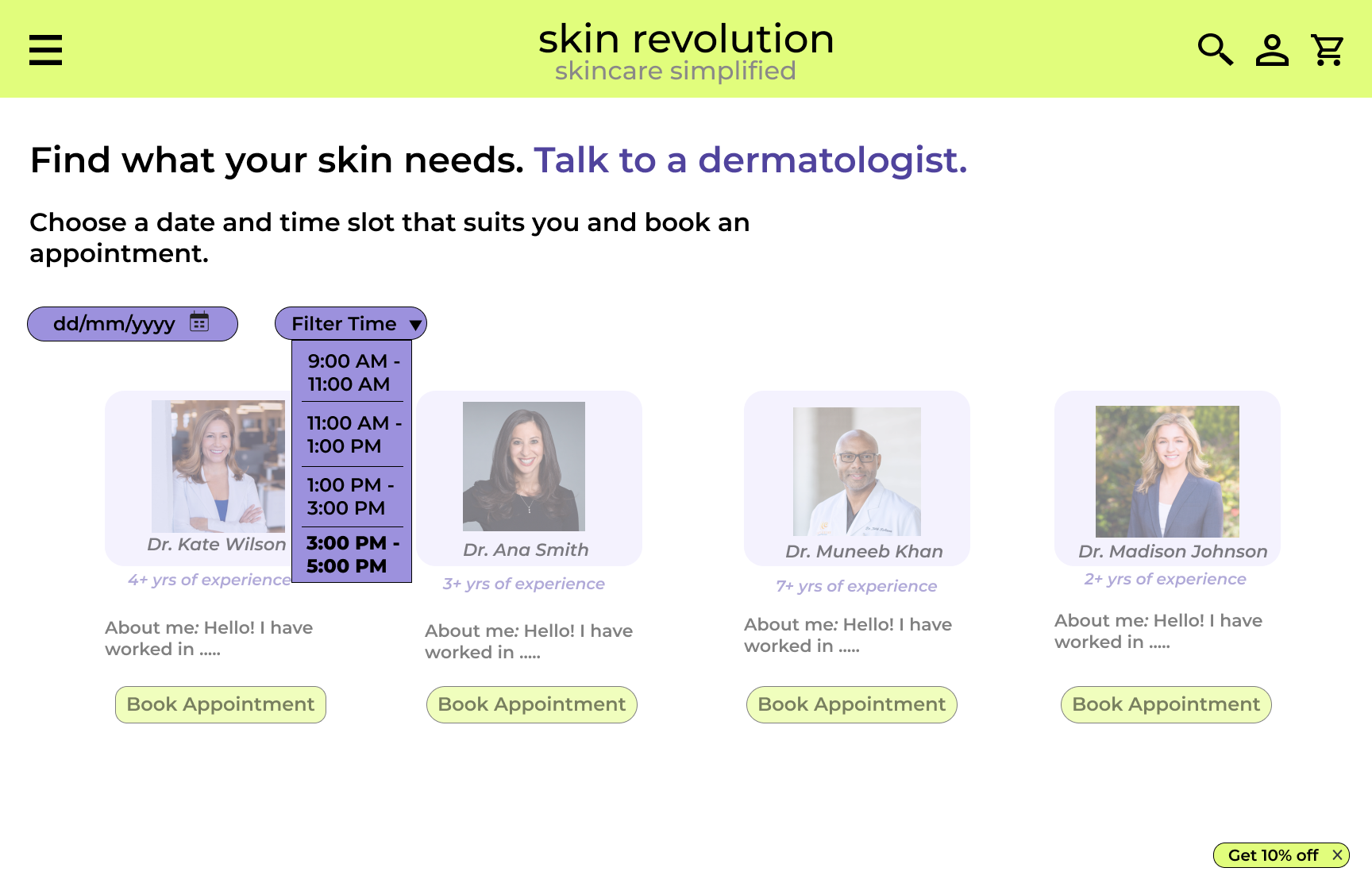
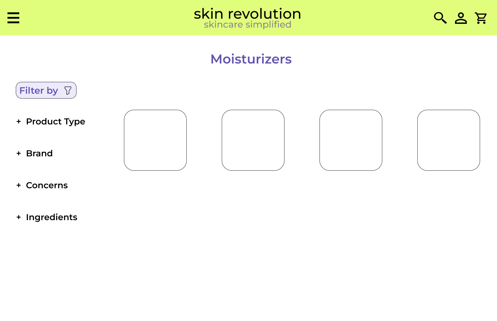
Following the user research phase, I transitioned into the design process by creating low-fidelity wireframes. These initial sketches served as a foundational blueprint for the skincare e-commerce platform, allowing me to explore the layout, structure, and placement of key elements without the distraction of detailed design elements. The low-fidelity wireframes were focused on establishing a clear and intuitive user flow, ensuring that the navigation and key interactions align with the insights gathered from user research. This stage was crucial for iterating on ideas quickly and gathering early feedback before moving on to more polished designs.
Low-Fidelity Wireframes
SOLUTION
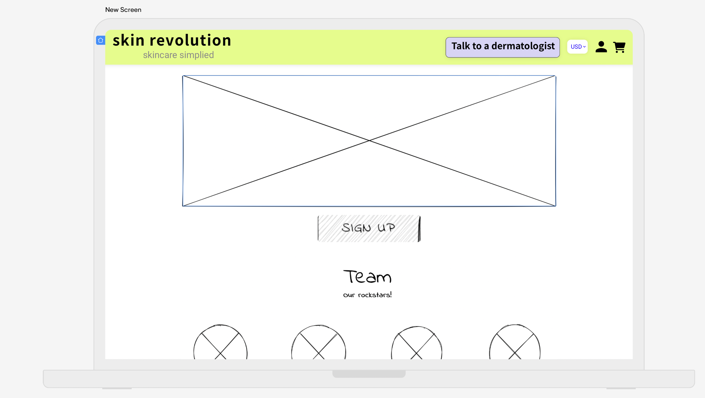
First Iteration
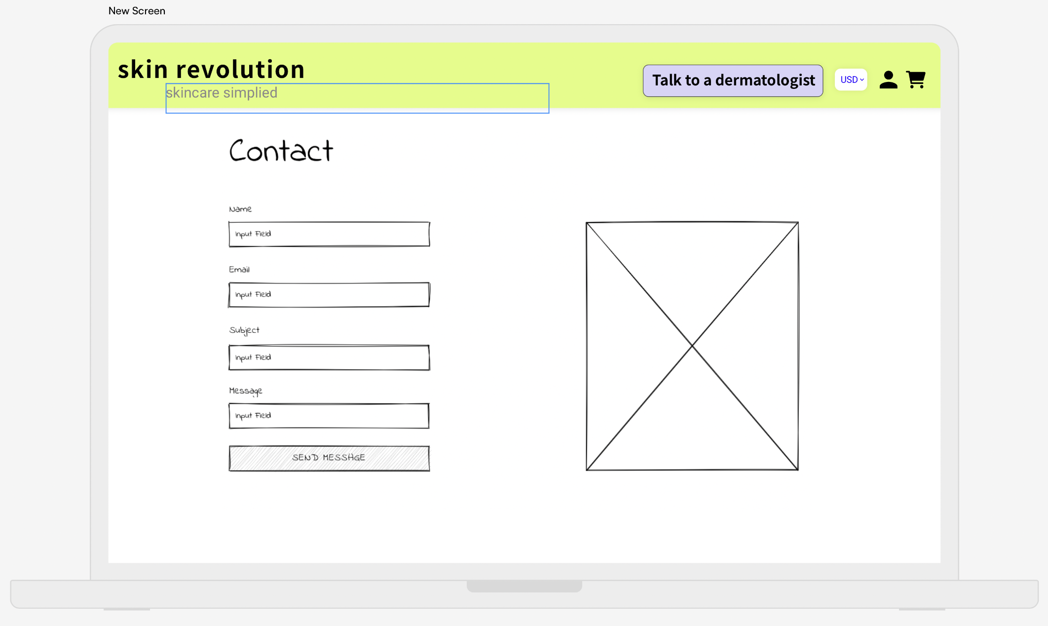
Second Iteration
DELIVERABLES AND FAQs
From insights to innovation: A skincare platform that users can trust
Other Projects
Got a design challenge or just want to connect?
I'm just an email away! 📩
